Project Description
Design brief
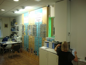
Mr. Korpal approached us with the task of converting his dated practice into a modern one.
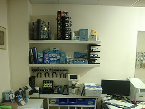
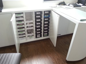
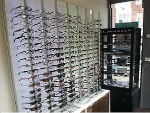
He wanted to have a clean look but not cold and with an inviting feel to it. The practice shares the same premises with his other business which is a dental surgery. He had lots of stock but didn’t have anywhere to display and store it.
Solutions
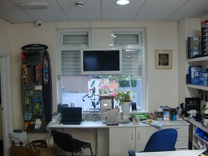
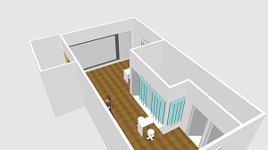
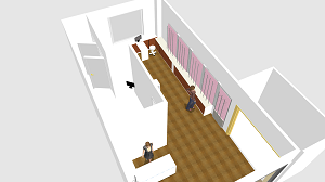
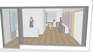
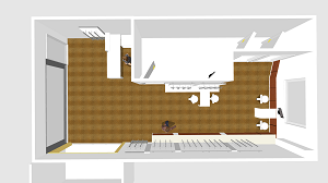
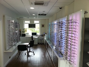
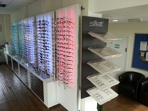
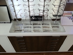
We used our base cabinets with shallow drawers to enable as much stock as possible to be stored and so we could have the base cabinet only on one side of the shop.
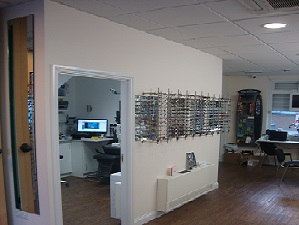
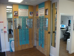
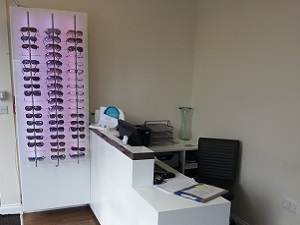
This saved a significant amount of space so we could fit the dispensing desk together with the display panels on the other side without blocking the flow of traffic.
Also, this solution enabled us to move the other dispensing desk to the back of the practice.


