Project Description
Design brief
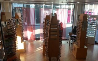
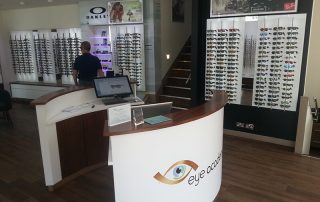
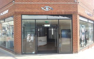
The practice looked dated. In need of complete refit.
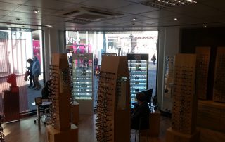
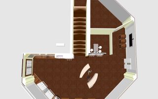
The freestanding units cluttered the practice floor and obscured the view.
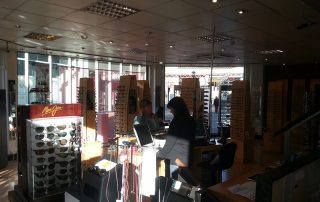
Very hard to control what was happening in the practice.
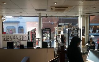
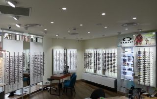
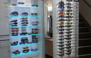
It needed to project to the public the image of high end stock and cutting edge optical equipment. rods after rods.
Solutions
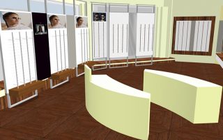
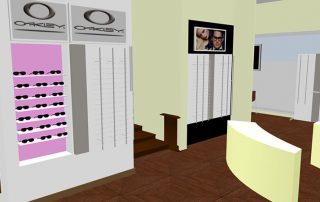
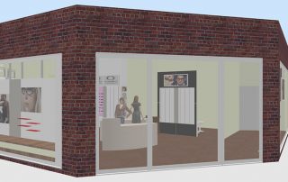
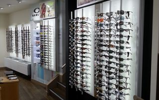
Using our DUAL display units on the wall, the stock inside the unit is double the amount on display on the front of the unit.
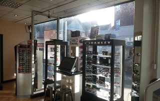
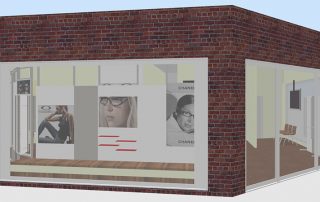
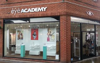
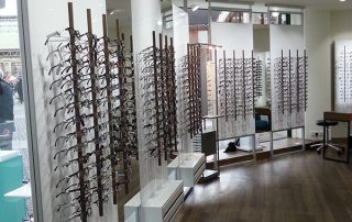
For the window we used our TELESCOPE units which, combining with the display rods, the mirrors and the drawers at the bottom, greatly increased the numbers of frames.
This solution doesn’t restrict the light coming into the shop. The units on the street side have shelves to place various advertising posters and promotions.

